Section: 4 🔖 Plots
When you import your data to R studio one of the first things you do is plot. Data visualization is a key components of data analysis. Before we talk about plots, we introduce some very basis data structures in R: vectors, data frames and tables. These are introduced below in the form of code snippets that you can run and modify.
Then we are ready to plot!
We will introduce several basic plots such as scatter plot, bar plot, boxplot and mosaic plot. How do we know which plot to apply? It depends on whether the variables to be plotted are categorical or numerical. Below we show a simple table which can serve as a guide which plot to use depending on types of variables to be plotted.
| NUM x NUM | scatter plot |
| CAT x CAT | mosaic plot |
| CAT x NUM | box plot |
| NUM | box plot, histogram |
| CAT | bargraph |
4.1 Scatter Plot
- Scatter Plot are used to plot two numerical variables.
- Hence it is used when both the labels are numerical values.
Lets look at example of scatter plot using Moody.
4.2 Bar Plot
- A bar plot are used to plot a categorical variable.
- This rectangle height is proportional to the value of the variable in the vector.
4.3 Box Plot
- A boxplot is used to display a numerical variable.
- A boxplot shows the distribution of data in a dataset.
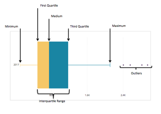
- A boxplot shows the following things:
- Minimum
- Maximum
- Median
- First quartile
- Third quartile
- Outliers
4.4 Mosaic Plot
- Mosaic plot is used to visualize two categorical variables.
4.5 Misleading Graphs
Beware of misleading graphs.
The following graphs artificially exaggerate their claims by manipulating either the Y-axis or X-axis. Typically this effect can be achieved by moving the beginning of the scale (Y or X) from zero to much larger value. Such axes manipulations result in exaggerating otherwise minor trends and differences.
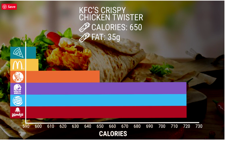
Figure 4.6.1
Differences between calories are not as large as it appears on the graph above. The range is just between 590 and 720, but because of moving the origin of the X-axis to 590, the bottom three bars seem to be multiple times larger than the top 3. KFC and MacDonald look much better than they should.

Figure 4.6.2
Number of people on welfare appears to be growing rapidly. In fact, it is growing by total of around 12% in 3 years. This is a far cry from 4 times – when judging from the height of the last bar as compared with the first, leftmost bar.
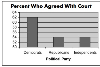
Figure 4.6.3
It seems like the fraction of Democrats who agree with the court is much higher than the fraction of Republicans or Independents (seems like 3x of democrats agree with the court as compared to Republicans). By moving the origin of the Y-axis to 50, the difference of 8% points between Democrats and republicans is grossly exaggerated.
Similar effects are achieved in the graphs below – moving the origins of axes exaggerates the difference in bar sizes.
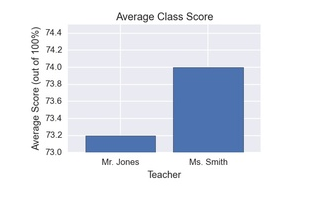
Figure 4.6.5
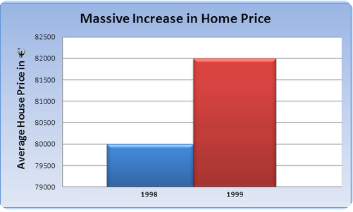
Figure 4.6.6
The home price increase is not massive! It only appears to be by manipulation of the graph! Neither is average class score for Ms Smith vs Mr. Jones.
- Optical Illusions
Depending how pie-chart is presented some slices may appear much larger than they really are. For example item C is the same size as slice A, but it appears much larger.
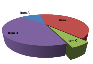
Figure 4.6.7
Notice the graph below is reversed. What looks like a drop is in fact increasing!
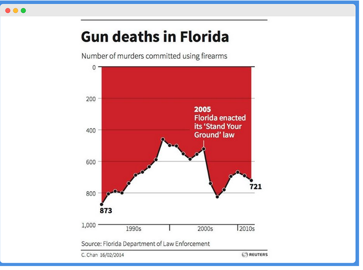
Figure 4.6.8
- Misleading Message
In these two side-by-side graphs we have Y-axes labeled by different variables (number of countries and cases per 10000 respectively). This is why the comparison is a bit like apples and oranges.
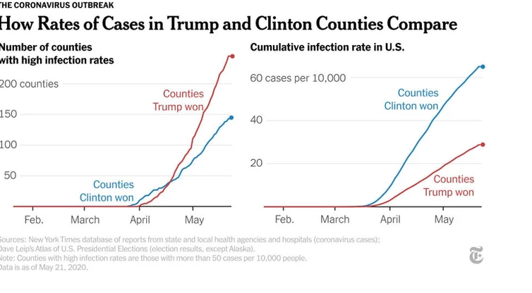
Figure 4.6.9
- Correlation vs Causation
This is one of many examples of graphs showing spurious correlation which looks like causation. The two unrelated quantities change in time very similarly but have nothing to do with one another!
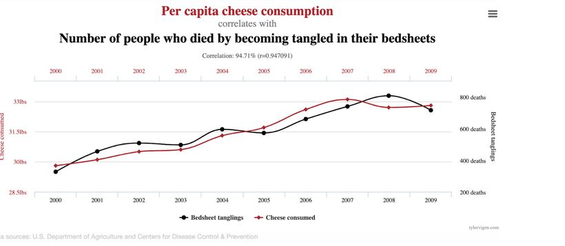
Figure 4.6.10
- One sided arguments
The graph below shows only half of what should be the full argument. What about people who did not go to college at all? We are missing the “base” here.

Figure 4.6.11